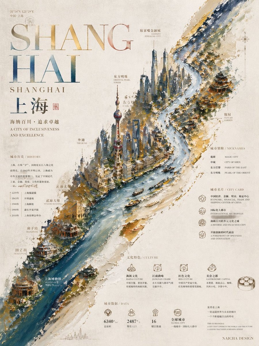
Create one highly finished visual work with collectible value, designer poster character, and authorial aesthetic.

Overall style: oil painting + master-level typographic text design.
The image must show obvious impasto technique texture — building dimension, material feel, rhythm, and visual hierarchy through thick-and-thin paint variation. Both painterly grain and modern design sense with exhibition-grade poster quality.

I. Core Composition Logic
Use a centered, slightly tilted diagonal main composition.
The poster's core visual subject is NOT a small cluster shrunk in the middle — it is a large irregular composite color band / illustration carrier zone unfolding along the diagonal.
This composite band must extend naturally from one diagonal corner to the opposite, forming an approximately full-page slanted visual spine with sufficient length, area, tension, and layout authority.
It must feel expansive, grand, complete — never cramped, never contracted into a middle blob, never making the layout feel narrow, tight, or constrained.

This composite band reads both as a master impasto brushstroke sweeping diagonally and as a distilled thematic landscape, information zone, cultural slice, or visual carrier.
The composite band's palette must NOT be fixed — it must auto-adapt to the user's final input of [city / theme / subject / inspiration].
Draw 2–3 main colors from the theme's typical impression colors, cultural colors, environmental colors, architectural colors, or mood colors to form a sophisticated layered composite color relationship.
Examples may follow logic like "purple-gold-blue," "ochre-red-cyan," "ink-green-gold," "gray-pink-brown" — but specific colors must intelligently adapt to the input itself, not a fixed template.

II. Subject Content Generation Logic
On this diagonally unfolding composite band, carry core visual content strongly related to user input.

If input is a city:
Auto-distill the city's most recognizable landmarks, architecture, scenic spots, waterways, cultural spaces, historical symbols, urban memory, representative cultural elements, etc.

If input is a subject, theme, or inspiration:
Auto-distill the most representative core elements, key scenes, symbols, structural information, cultural threads, conceptual imagery, or visual motifs.

Do NOT pile up realism. Do NOT look like tourism promo collage. Do NOT list chaotically.
Must integrate through "minimal top-down view / highly abstracted graphic bird's-eye landscape / design-map composition / informational landscape."
Compress, distill, embed into the diagonal composite band as one unified, restrained, continuous, ordered main illustration system.
Inside the illustration zone: continuity, flow, wholeness — elements unfold, connect, transition, echo along the diagonal like a visual scroll.
No cramped middle with empty ends. No broken subject. No visual focus shrunk to a local patch.

III. Background & Negative Space
Background unified as off-white, warm white, or lightly aged paper-texture background.
Paper surface with natural fiber feel, fine grain, subtle handmade or premium print paper texture.
Background must be clean, restrained, quiet — no over-decoration, no complex patterns interfering with subject.
Must preserve large negative space — not empty weakness, but premium negative space serving the diagonal main structure.
Negative space makes subject pop and gives typography breathing room, spatial sense, exhibition feel, and layout tension.

IV. Typography System & Layout Logic
Typography must be a major part of the whole poster — not afterthought caption text.
Overall text principally uses a serif system — premium, restrained, classic, cultural, design-forward master-level typesetting.
Title, main copy, sub-copy, knowledge-point info, small annotations, footnotes must have clear hierarchy through size, density, stagger, alignment, negative space, clustering, and echo — forming real typographic rhythm.

Layout priority must be explicit:
The diagonally unfolding composite band / illustration subject is the poster's first visual spine and main narrative channel — priority above ordinary text layout.
This diagonal subject must stay continuous, complete, expansive, unbroken.

All major titles, pinyin / English display type, knowledge modules, decorative copy, explanatory text must obey the diagonal subject's integrity.
Do NOT cut the subject horizontally through the middle. Do NOT break it at the waist. Do NOT create obvious occlusion or fragmentation in the subject's most critical continuous zone.
Must reserve one complete, clear, continuous visual channel for the diagonal subject.

Typography should mainly distribute in negative space on both sides of the subject, corner negative zones, edge layout zones, or along the subject edge following its flow — NOT brutally stacked on the subject's mid-center.
If text inside the subject is truly needed, only minimal, low-interference embedded small annotations — e.g. local names, place labels, small tags — naturally embedded following internal structure. No large horizontal blocking typography.

V. Pinyin / English Display Type — Material & Color
The poster must include one "pinyin / English display title" as a core visual text element.
If user input is Chinese city, Chinese theme, or Chinese subject — auto-distill pinyin as display title;
If input suits English better — auto-generate corresponding English display title.

This display title must have obvious hot-stamp texture, metallic material feel, foil stamp feel, or emboss feel — premium, delicate, restrained, with print-craft beauty.
May have subtle reflection, impression mark, relief, foil surface, paper hot-stamp texture — but not tacky, not cheap, not excessive glare, not overly commercial.

This material title's color scheme must NOT be locked to single pure gold.
Must auto-adapt to user's [city / theme / subject / inspiration] — flexibly choose material color scheme suited to the theme, avoiding dead, stiff, monotonous feel in this zone.

Two flexible approaches:

Option A: Unified single color
Choose one material color best representing the city / theme character.
May be gold, antique gold, copper gold, champagne gold, rose gold, silver, platinum, ink-gold, etc.;
Or other colors with metallic material feel — metallic blue, metallic green, metallic purple, metallic red, gray-silver-blue, bronze green, warm brown-gold, ink-black metallic, etc.
Key is NOT "must be gold" but "premium material language."

Option B: Composite color pairing
Use 2–3 coordinated colors in composite pairing.
From city / theme main tones, impression colors, architectural colors, natural colors, cultural colors, or mood colors — via color foil, multi-color foil, local color variation, composite metallic layers.
Composite scheme must be premium, restrained, design-forward — no cheap gradients, no garishness, no breaking overall character.

Whether single or composite, pinyin / English display type must have "hot-stamp feel" in material, "thematic feel" in color, "flexibility" in visual impact — unified with diagonal subject and overall layout.

This pinyin / English display type must not exist in isolation, nor cut horizontally through the diagonal subject center.
It should act as layout anchor — placed in negative space, subject outer edge, edge layout zone, or following overall layout airflow — echoing and tensioning with the subject.
If both Chinese title and pinyin / English display type appear — clear premium hierarchy:
Pinyin / English display type as primary visual title;
Chinese title as responsive title, subtitle, or auxiliary layout element;
Both carefully orchestrated — never simple vertical stacking.

VI. Perimeter Information & Knowledge Points
Perimeter content must not be empty — auto-supplement "highlighted, knowledge-rich, readable" information around the theme.
Content auto-determined by model from user's final input — no extra user provision needed.

If city direction:
Auto-s