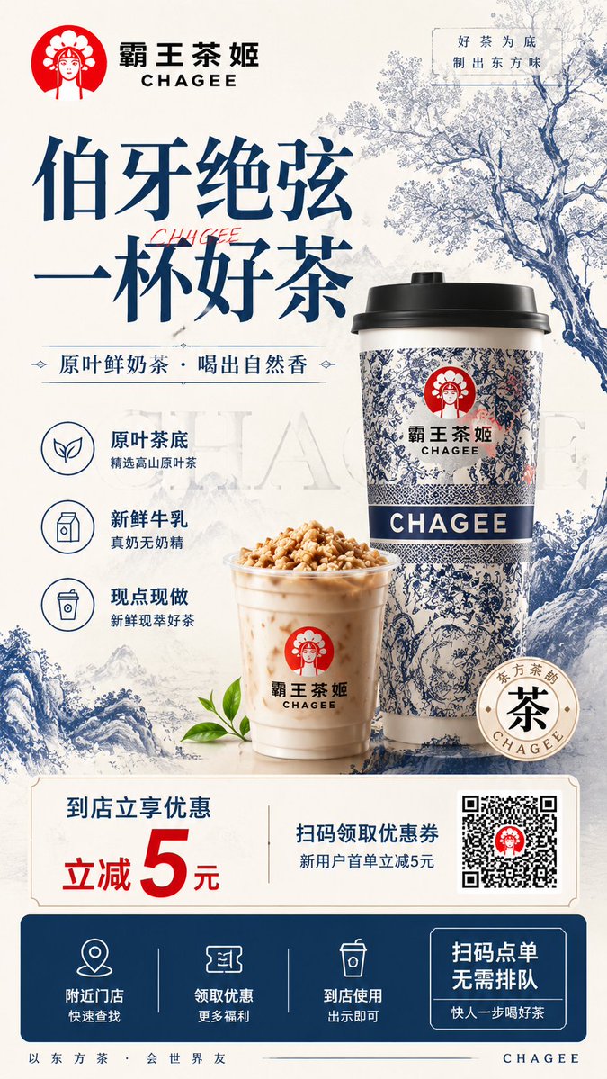
Generate a 9:16 vertical F&B brand promotional flyer design.

The brand name is "CHAGEE" (Bawang Chaji), category: "New Chinese-style tea / milk tea", flagship product: "Pure Leaf Fresh Milk Tea." The overall visual style is new Chinese-style premium tea brand, blending Eastern blue-and-white porcelain motifs, Song-dynasty negative space, modern commercial ad layout, and youthful trendy tea culture appeal.

The overall palette uses off-white, rice-paper white, blue-and-white porcelain blue, deep navy, and a small amount of brand red as the primary color system, forming a clean, high-end, Eastern, refreshing, textural visual atmosphere. The background uses subtle Eastern ink-wash landscapes, blue-and-white porcelain textures, tea branches and leaves, clouds and mist, and fine paper grain as decoration—not cluttered, not cheap collage.

Top-left: clear brand identity zone featuring the CHAGEE brand name and English subtitle, with a simple circular Eastern female portrait logo graphic nearby. Top-right: add a short brand-mood line, e.g. "Good tea as the base, crafting an Eastern taste."

Upper-middle: oversized headline:
"Bo Ya Jue Xian"
"A Cup of Good Tea"
The headline uses premium Eastern Song-dynasty / calligraphic headline type, with powerful strokes, clear and eye-catching, carrying the new Chinese-style tea ad aesthetic. Below the headline, add a subtitle:
"Pure Leaf Fresh Milk Tea - Drink the Natural Fragrance"
or "Pure Leaf Tea Base - Fresh Milk Crafted - Refreshing Tea Aroma."

Right side or middle: primary product visual zone, featuring one large and one small CHAGEE-style tea drink product. The main cup is a takeaway paper cup, with blue-and-white porcelain motifs, blue-white Eastern patterns, brand identity marks, and CHAGEE text on the cup body. Beside it, place a transparent cup of milk tea, with possible nut crumbles, milk cap, or tea fragrance granules on top. The milk tea color is natural and smooth, with a fresh texture. The cup wall has subtle condensation and highlights. The overall look is realistic, refreshing, delicious, and appetizing.

Next to the product: 3 selling-point icon modules, simple linear icon style:
1. Pure Leaf Tea Base: Selected high-mountain pure-leaf tea
2. Fresh Milk: Real milk, no creamer
3. Made to Order: Freshly brewed on the spot

Bottom: promotional conversion zone using a clean horizontal info card:
Left side highlights the offer:
"Visit store for instant discount"
"5 Yuan off"
Middle section:
"Scan to claim coupon"
"New user first order discount"
Right side: QR code placeholder zone—QR code area is clear but do not generate a real scannable QR code; use a simple QR code placeholder graphic.

Very bottom: call-to-action bar using a deep navy background, containing three step icons:
"Nearby Stores"
"Claim Discount"
"Visit & Use"
Right side adds button-style copy:
"Scan to Order"
"No Queuing"
"Get Your Tea Faster"

The overall information hierarchy must be clear: Brand Logo > Headline > Product Visual > Selling Points > Discount Amount > QR Code / Store Action. The layout must look like a real offline promotional flyer, usable for store distribution, Xiaohongshu (Little Red Book) display, WeChat Moments sharing, and in-store QR conversion.

Design requirements: premium but not cold, commercial but not cheap, new Chinese-style but not old-fashioned, distinctly Eastern but aligned with youthful tea brand aesthetics. The product must be the dominant visual subject. Cup material, paper cup texture, milk tea liquid, ice sensation, and lighting must all be refined and realistic. Text layout must be clean, with negative space and order—no excessive information cramming.

No: garbled text, typos, strange English, multiple different brand logos, low resolution, low texture, chaotic colors, excessive fonts, cramped layout, information overload, low-quality product images, unappetizing milk tea, weak brand recognition, style confusion, cheap promo template feel, excessive decoration, QR code stealing visual focus, dark or dirty tones, unrelated to new Chinese-style tea, different-brand collage feel.